NOFAR SHALOM

Introduction
"Give a smile" is an association that puts out projects in the social community.
The association advocates full transparency, and in various ways to contribute to projects-
Donation

Volunteering

Donating items

The problem
There are a lot of associations in the market that raise donations and volunteers, so it is more difficult to finish projects.
The solution
Create an interface that will make the user contribute to projects in the "give a smile" organization.
Concept
1. Achieving goals and winning benefits-
Motivating the user to contribute / volunteer in a playful and enjoyable way, while accumulating points that enables the achievement of certain goals and benefits.

2. Sharing by volunteers / donors through social platforms-
Motivation of the user to donate / volunteer thanks to sharing, for example, uploading photos and videos that will reflect the project itself. This way can intrigue people who do not usually volunteer.

Connecting the 2 concepts can increase the percentage of
volunteering and donations.
How it works?
First, the user must register for the site. The user can set monthly goals in each support platform (donation, volunteering and donating items).
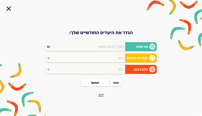
For each project, write down the number of smiles the user will receive, what the project goal is, and how many have been recruited so far.

Smiles number
The goal
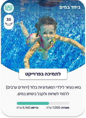
In order to win benefits, the user has to turn the wheel of fortune. The wheel of fortune is conditioned by the smiles he has accumulated and the limit of once a month.

Projects page

Product page

Payment process
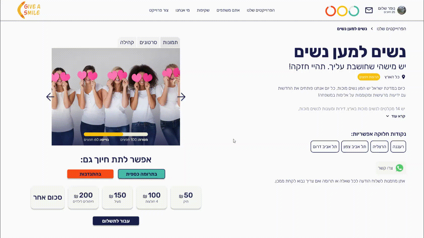
Profile data

UI design
The color palette is a mix of warm and cold colors.
Each color symbolizes the type of project support:
.png)
The reddish color, which is the warmest color, symbolizes volunteering.
.png)
The yellow color symbolizes the contribution of objects.
.png)
The green color,
which is a cold color, symbolizes a financial contribution.
.png)
The dark blue color is used for the text.
I chose these colors because they are vivid and happy colors, the colors give an optimistic atmosphere and in addition contribute to the interest of the gamifications.
Font: RUBIK
About the LOGO
The logo consists of the name of the association and on the left side there is a boomerang. The boomerang is a game that when thrown away it comes back to you, just like in the interface. When you support projects you get benefits.
In addition the shape of the boomerang is a smile so the bold letters signify the eyes.
